As a school manager, use this report to learn how well the students in your school are meeting your usage and achievement goals for ClearFluency. Students who consistently use the ClearFluency software and progress through content while maintaining a high level of performance typically gain the most benefit from the component.
Only school managers and district managers can access this report.


This chart provides a summary of how well the students in the school are meeting Reading Assistant performance and implementation expectations. The selection performance metrics—Reading Level High Score and Developing or Above—measure actual Reading Assistant achievement. The component usage information—minutes per week and selections per week—allows you to quickly measure implementation in your school.
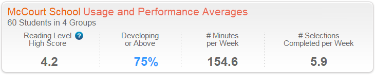
# Students in # Groups. The number of students in the school who used Reading Assistant within the selected date range, and the number of groups to which those students belonged. These are the students included in the report.
Reading Level High Score. The average Reading Level High Score for the students. Students who have not mastered any selections are not included in this calculation. If none of the students have earned a Reading Level High Score, this field shows N/A. To learn more see Reading Level High Score.
Developing or Above. The percentage of selections completed at a performance level of developing or proficient. mySciLEARN uses colors to rate this percentage as excellent (green), good (blue), or needs improvement (red). To learn more see Developing or Above.
Minutes per Week. The average number of minutes per week the students spent using the component, including time spent repeating selections, and selections that are still in progress. Students who spend the expected amount of time using the software each week—as prescribed by either the Reading Assistant schedules or by your school's schedule—are more likely to improve their performance and achieve success.
Selections Completed per Week. The average number of selections per week completed by the students. Students who consistently complete content each week have a greater chance of improving their performance and achieving success. To learn more see Completing selections.
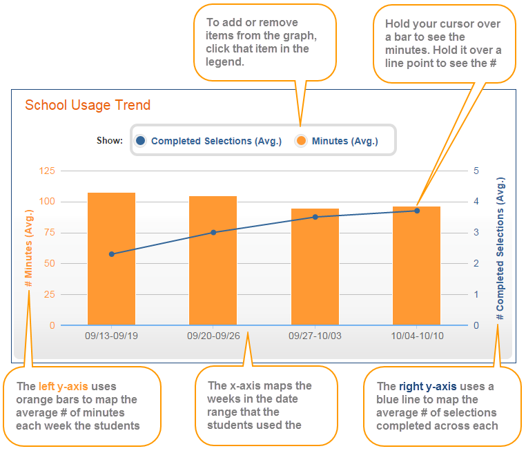
This graph illustrates how well the students in the school are meeting your implementation goals for each week in the date range. Reviewing these results over multiple weeks can help you identify component usage trends and—if needed—take corrective action, such as monitoring student usage in the classroom or providing incentives to increase productivity.
X-axis. Maps the weeks in the date range that the students in the school used ClearFluency. If none of the students trained during a week, that week does not appear in the graph.
Y-axis. Maps two related usage trends for the students:


By default, this graph shows all results. You choose which data to include in the graph by clicking that item in the legend at the top of the graph. Hold your cursor over an item in the graph to view the actual minutes or selections, broken down by completed selections and repeated selections.
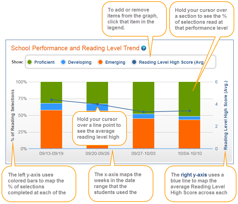
Use this graph to view the school's selection performance for each week in the date range. Reviewing these results over time can help illustrate student progression trends and reading proficiency gains.
X-axis. Maps the weeks in the date range that the students in the school used ClearFluency. If none of the students trained during a week, that week does not appear in the graph.
Y-axis. Maps two related performance trends for the students:
% of Reading Selections. The stacked orange, blue, and green bars show the average percentage of selections completed at each performance level; that is, the percentage of selections completed at each of the levels. To learn more see Performance Levels. The reference scale appears on the left side of the graph.


By default, this graph shows all results. You choose which data to include in the graph by clicking that item in the legend at the top of the graph. To view the actual results in the graph, hold your cursor over that item in the graph. For example, if you hold your cursor over a section of a bar graph, you'll see the percentage of selections completed at that level that week and the number of selections completed at that level over the total selections completed at all levels that week. If any selections were repeated at any level that week, you'll also see how many selections out of the total completed selections that week were repeated.
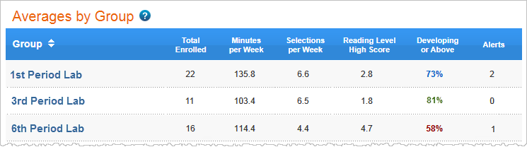
This table provides implementation details for the groups in the school that used ClearFluency within the selected date range. It lets you easily compare results across groups.
The table includes the following columns. Click a column header to sort the report.
Group. The groups in the school that used Reading Assistant within the selected date range. Click a group name to access the implementation success report for that group.
Total Enrolled. The number of students in the group who used Reading Assistant within the selected date range.
Minutes per Week. The average number of minutes per week the students spent using Reading Assistant, including time spent repeating selections, and selections that are still in progress. Students who spend the expected amount of time using the software each week—as prescribed by either the Reading Assistant schedules or by your own schedule—are more likely to improve their performance and achieve success.
Selections per Week. The average number of selections per week completed by the students. Students who consistently complete content each week have a greater chance of improving their performance and achieving success. To learn more see Completing selections.
Reading Level High Score. The average Reading Level High Score for the students. Students who have not mastered any selections in the date range are not included in this calculation. If none of the students have earned a Reading Level High Score, this field shows N/A. To learn more see Reading Level High Score.
Developing or Above - The percentage of selections completed at a performance level of developing or proficient. The percentage is rated as excellent (green), good (blue), or needs improvement (red). To learn more see Developing or Above. If none of the students have completed a selection, this field shows N/A.
Alerts. The total number of intervention alerts for the students. An intervention alert indicates that a student requires immediate attention. If there are no interventions, this field is blank. Intervention alert details appear in the student level implementation report. To learn more see About report status updates and alerts.
Tip: If you export this report with All Students selected under Filter by My Groups, the exported report also includes student IDs for each student in the report. To learn about student IDs see Required student information. To learn about exporting reports see Export reports (Excel).